花家地是个很诗意的名字,但在20世纪90年代之前,这里不过是一片种植花椒的耕地。如今,你无法找到这里曾是田园的任何线索,它已成为这座庞大且混杂城市的一部分。90年代建成的花家地小区,住着形形色色的人,他们来来往往,房屋兴替荣衰,人们自顾自编织着属于自己的生活。
The Huajiadi(means flower house place) is a very poetic name, but before 1990s, it was just a farmland for planting pepper. Now, you can’t find any clue that this once was a pastoral, and it has already become part of this gigantic and chaotic city. The Huajiadi District built in 90s, lived the people of various kinds. They come and go, and the houses boom and bust while people keep weaving their own life.
一:轴线的机遇 The Opportunity of the Axis
一个博物爱好者想在拥挤的旧楼中重建他的生活。但这栋老式公寓的早期设计显然不算常规。
机场高速在东北二环上接了条斜线,花家地一带45度角街区结构随之而生,引得走惯了横平竖直四九城的出租车司机的抱。而上世纪末建设的这幢临街塔楼,自然而然把斜线吸收其中,于是三角边界线成为这个小户型平面的显著特征。
An amateur naturalist wants to rebuild his life in this crowded old building. But the early design of this old-fashioned apartment is obviously not regular.
The airport expressway has a diagonal line connected to the second ring road in southeast area. The structure of the 45 degree corner in the area of Huajiadi hence has been formed, and it got complains from taxi drivers as they are accustomed to driving in the vertical and horizontal city. At the end of the last century, the construction of this street tower, naturally absorbed the slant line, so the triangle boundary line become a significant feature in the cross section of this small apartment.
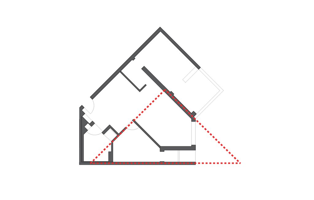
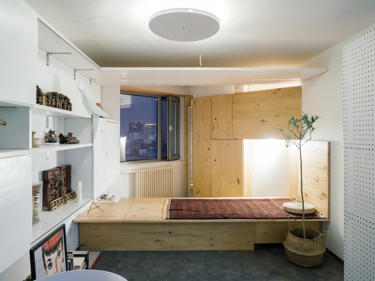
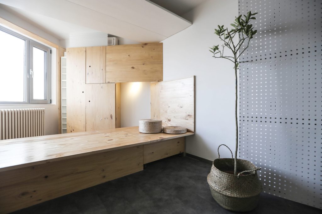
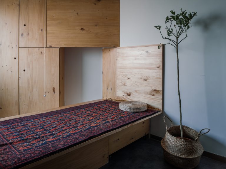
从售房网站上张贴的卖家内装图来看,厕所和厨房出现了死角,起居室隔成两居显得空间逼仄,做大一居又产生功能缺陷,且放不进合适尺寸的家具。然而意外地,这样的户型同时制造了一个“多点透视”妙趣视角,状如园林的分岔廊道。From interior pictures posted on the housing website, toilet and kitchen appeared dead corner, the living room is separated into two cramped space, the bigger one with functional defects, cannot fit into proper size furniture However, unexpectedly, at the same time this apartment layout creates a “multi perspective” groovy visual, similar to garden with diverging corridors.

It is said that the Central Academy of Fine Art is a disastrous area for “road observation”, and the area not far from the Academy also provides cannonball for “modernology”. Similar problems exist within other old communities in Beijing. The saturated parking spaces force the original possible public space into a less than 50 square meters entrance. However, interesting public life are carried on each day. The wooden board that is close to the bawn is folded, and inside of it is full of mirrors, razors and turn into a barber place into a second. Beside the low tables and chairs, the cold winter still doesn’t cover the enthusiasm of the old men playing chess. The repair booth retracted the iron facade, and all kinds of newspapers and beverages are lined up. However, no matter how messy the day’s chairs are, all the furniture at the end of the night is placed back to their spots, and all of them are stored without exception . This cramped space actually contains public life of dozens people, this set of 70 square meters of furniture interior provides a very important designreference, a wooden table facilitates sleep, storage, work, leisure, and projection a serious of functions (Right,living room GIF). Bedroom hides panel of reading table (Upper,bedroom GIF), with flexible single furniture and carpet collocation, easily change different life scenarios.
二:路上观察的启示 The inspiration of “Observation on the Road”
据说美院是“路上观察学”的重灾区,与美院不远的这片小区也为“考现学”提供炮弹。和北京老旧小区面临着相似的问题,饱和的停车位将原本可能的公共空间逼到小区入口不足50平米的小空间,然而这里每天却发生了非常有趣的公共生活。紧靠小区围墙的木板被折开,其内侧排满了镜子,剃刀,秒变成理发亭。而在低矮桌椅边,寒冷的冬日仍不掩老大爷们“将军”的热情。修理亭收起铁皮的立面,各种报刊饮料排排站。然而无论白日的座椅如何凌乱,入夜所有的家具们则各归其位,收纳至简,毫无例外。这样逼仄的小空间里竟容纳着数十人的公共生活,这种活动家具的布景术为70平米室内提供了极为重要的设计参考,起居的木台容纳了睡眠,储物,工作,休憩,投影的多种功能(下图 客厅GIF)卧室也暗藏了阅读的台面(左图 卧室GIF),灵活的单人家具和地毯搭配,轻松地变化着不同的生活场景。

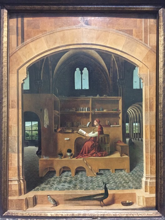
《圣杰罗马在书房》Saint Jerome in his study
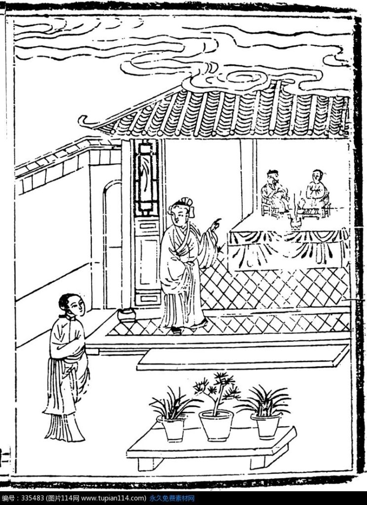
《拜见高堂》Greet the Parents
三:屋中造屋 Room Building within a House
伦敦国家画廊中《圣杰罗马在书房》(Saint Jerome in his study)一作中展示了这样妙趣的空间,一座单一色彩的巨大的家具(包含了书架书桌座椅)置于充满拱形的的室内之中,漂浮在浅色的地面之上,家具内部的拱顶结构和建筑室内的拱顶拱窗呼应,左侧的拱门勾勒出窗洞,将透视伸向更远的室外。而另一幅中国古典小说插图《拜见高堂》中,作为建筑的房间和位于室内的供桌,前景的供台融合一体,将两种截然不同的尺度以相似的形式并置。这两幅绘图至少透露出这样的信息:一:家具和室内空间相似相融,难舍难分;二:室内和家具产生类似分型的关系,换句话说,家具本身是缩小的房间。如此一来则会放大室内空间的尺度感,扩展视觉进深,产生重叠透视的感受。
Painting ‘Saint Jerome in his study’ from National Gallery in London depicted a fun space containing a monocolor large furniture (including bookshelf, desk and seat) in vaulted interior. Floating above the light colored floor, dome structure inside of furniture and the vault arched window are echoed with each other. The left arch drawing the outline of the window, stretched views further beyond. In another Chinese classical illustrations ‘Greet the Parents’ , the room of the architecture and the altar in the interior are integrated in balance, showing two different scales juxtaposedin a similar form. The two drawings revealed some information: furniture and interior space are similar in harmony; two: interior and furniture have similar scaling relations, in other words, the furniture itself narrow the room. In this way, it will enlarge the sense of the interior space, expand the visual depth, and produce the feeling of overlapping perspective.
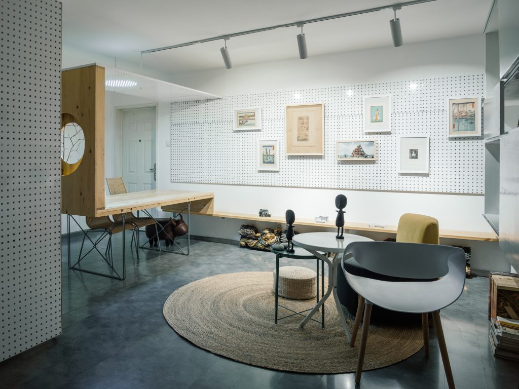
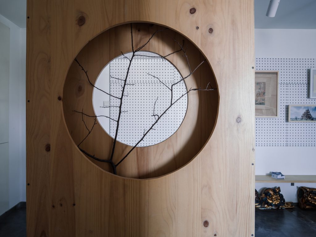
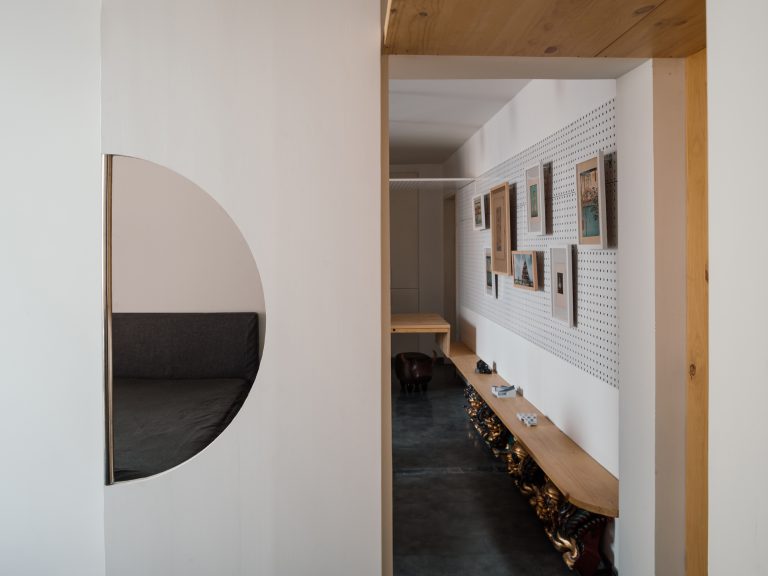
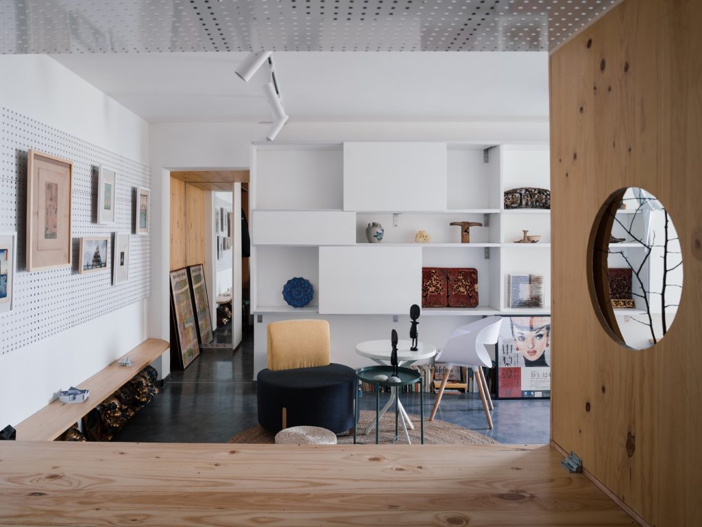
这种“屋中造屋”的手法被用在多处,比如房门入口处的框景桌,将视野打开;而起居,卧室,厨房三处临窗空间则被设计为形态各异的“窗亭”,局部的木色家具在整体白色空间中“框景”,变奏的材料表述使房间展示出更大的空透体验。
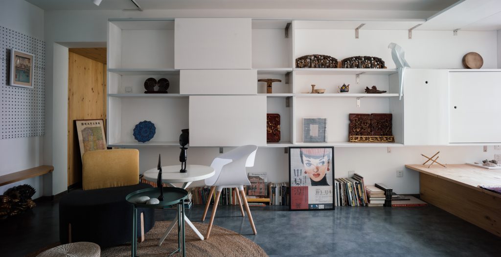
This “Room Building” approach is used in many places, such as table with view frame at entrance door, it will open the view, while window space designed in living room and bedrooms and kitchen created different forms of “window Pavilion”. The local wood furniture in the whole white space created “framed scenery”. The variation of material expression produced more spacial experience.
四:一座普通公寓的生长年轮 A Growning Ring in an Ordinary Apartment
室内设计往往将过往的历史擦除得一干二净,然而这里仍然希望留下一些“记忆”,一则“物尽其用”,减少水电改造的费用,二来去实验一些家具的“中古拼贴”。遗留的玻璃桌被作为结构承托木桌面,露出纤细的柱腿;
在施工中发现折叠门重量过大,于是裁出一米直径的半圆,结合宜家柱腿,做成可推拉的“吃饭”,“工作”,“梳妆”的三用“花好月圆”桌……
黑色的柜子被砍半,结合宜家柱腿形成厨房的储物柜;原本贴着黑瓷砖的厕所被进一步强化,形成《阴翳礼赞》里面描述的“幽寂”的如厕体验……
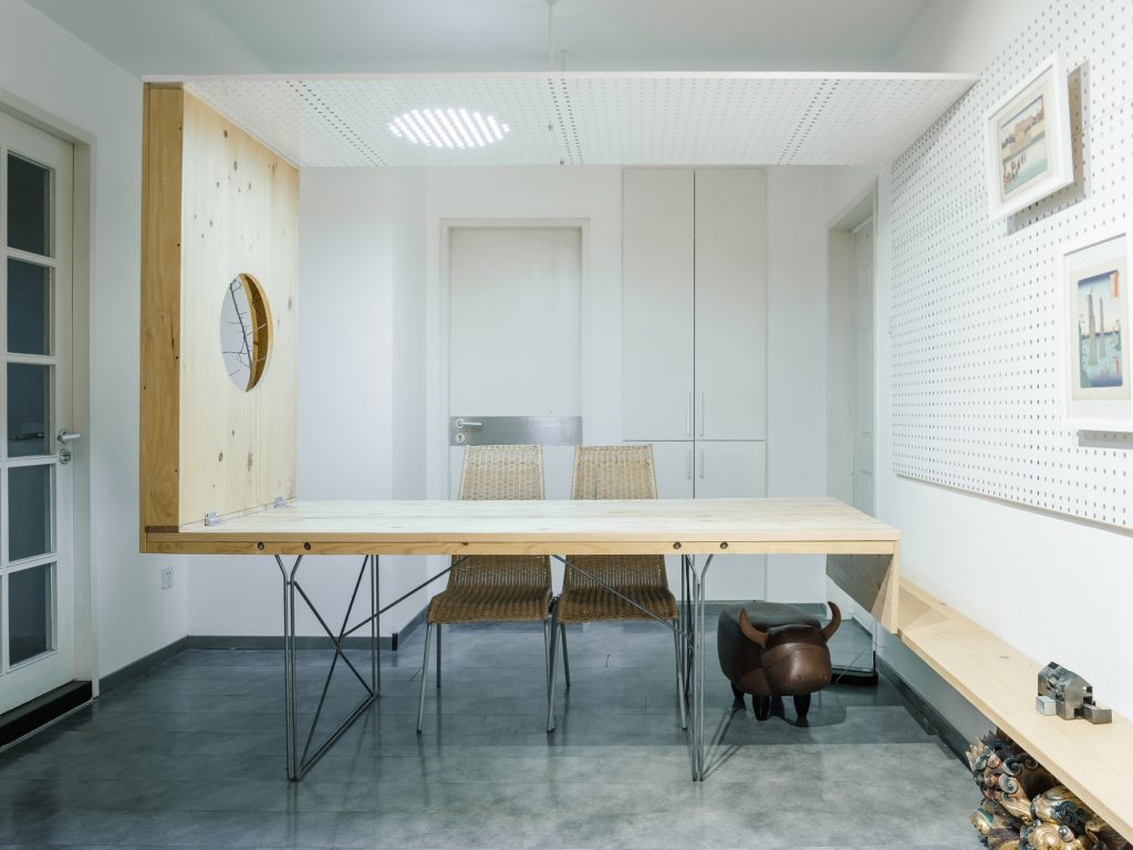
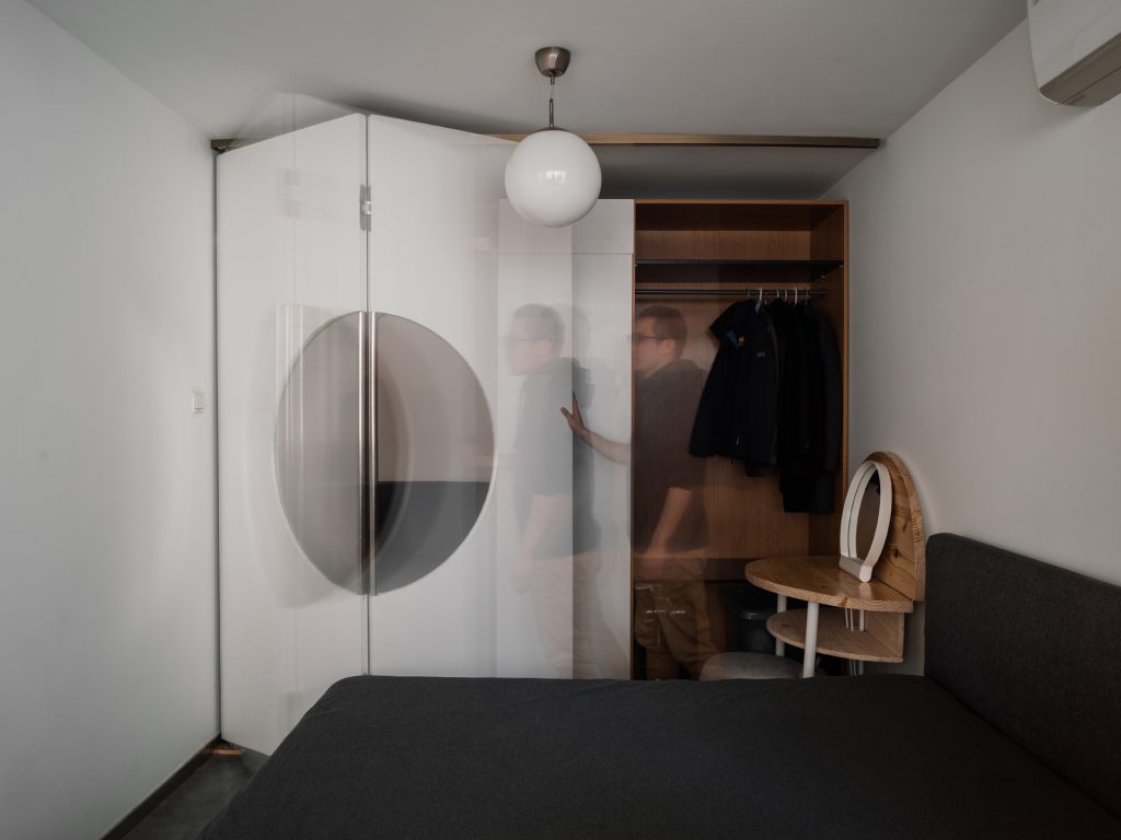
The interior design often will erase the past history completely, but there is still hope to leave some ‘memory’ here. A material with maximized usage on one hand,reduces the cost of the transformation of hydropower, and on the other hand, carried some experiments on furniture’s “medieval collage”. The leftover of the glass table used as supporting structure of wood desktop, showing slender legs. During the construction we found folding door is over heavy, so it is decided to cut out 1m diameter semi-circle, combined with IKEA column legs, a push and pull table is made for ‘eating’, ‘work’, ‘dressing’ three functions.The black cabinets were cut in half, combined with IKEA legs formed kitchen cabinets. The originally posted black toilet tiles were further strengthened, forming a ‘tranquil’ toilet experiencedescribedin the ‘Lob des Schattens’.
